
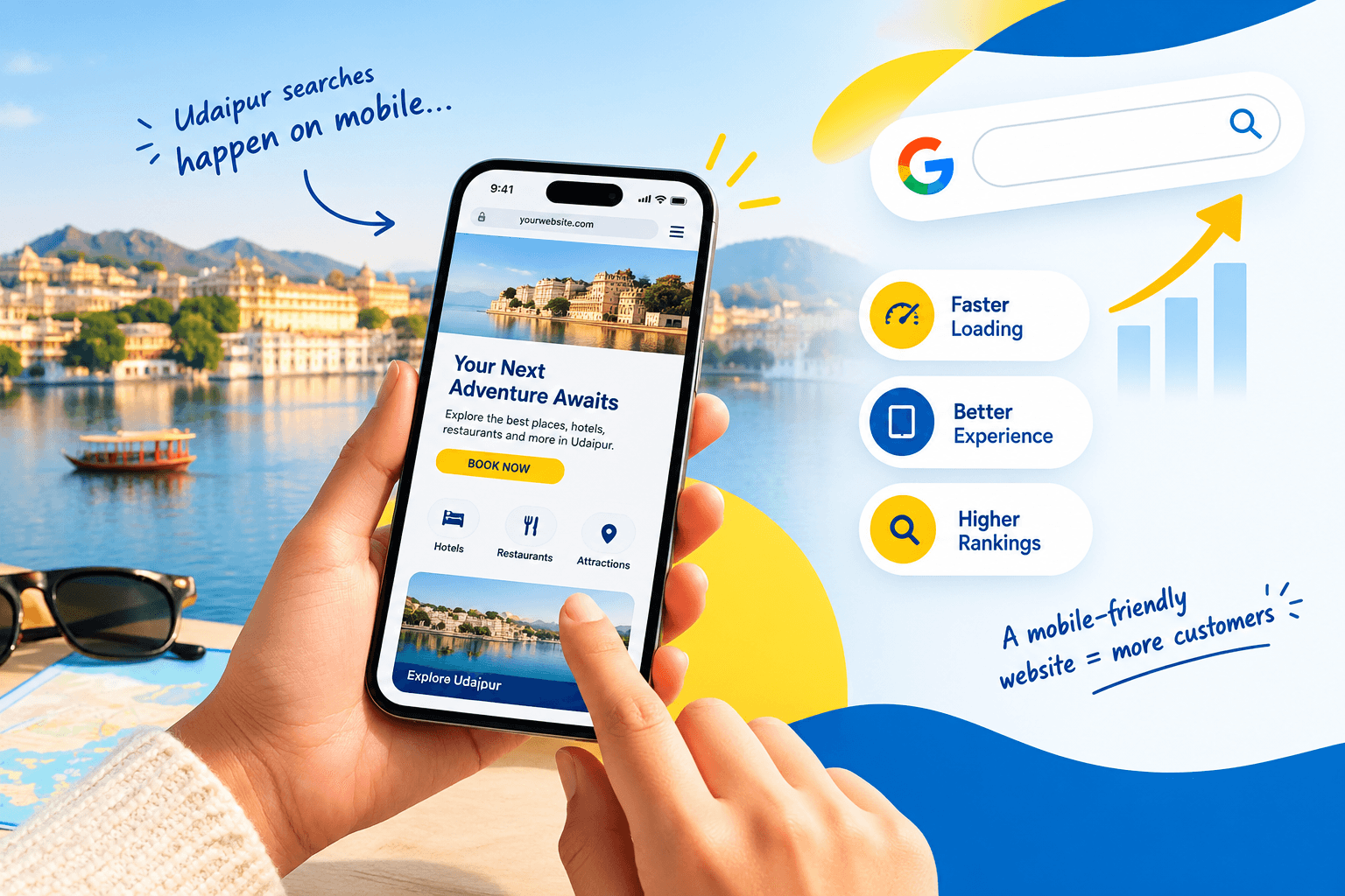
If you run a business in Udaipur, your next customer is probably holding a phone right now, and mobile SEO decides whether they find you or your competitor. A tourist searches for a rooftop café near Lake Pichola. A parent looks for a pediatrician close to Hiran Magri. A bride-to-be compares salons in Fatehpura. All of them search on mobile, and all of them judge your website within seconds.
Mobile SEO means optimising your website so it loads fast, reads clearly and works smoothly on smartphones, which helps Google understand and rank it. In this guide, you will learn nine practical steps to build a mobile-friendly website, avoid common mistakes and connect your site with your Google Business Profile. You do not need any technical background to follow along.
What Is Mobile SEO?
Mobile SEO is the practice of optimising your website so it loads quickly, displays correctly and works easily on smartphones, which helps search engines crawl, index and rank it.
It is not a separate website or a separate strategy. Instead, it is the SEO you already do, adjusted for smaller screens, slower connections and touch-based browsing. Good mobile SEO rests on three pillars:
- Usability: Text is readable, buttons are easy to tap and menus are simple.
- Speed: Pages load quickly, even on a patchy 4G signal in the old city.
- Content parity: The mobile page contains the same important content as the desktop page.
In short, a mobile-friendly website removes friction. Less friction means visitors stay longer, call sooner and book more often.
Why Mobile SEO Matters for Udaipur Businesses
Local searches happen on phones
People who search “dentist near me” or “best restaurant in Udaipur” are usually on the move. They want a phone number, directions or opening hours immediately. If your site loads slowly or the buttons are too small to tap, they go back to the results and choose someone else.
Tourism multiplies mobile traffic
Udaipur welcomes visitors throughout the year, especially in the wedding and winter tourist seasons. Guests look up hotels, cafés, cab services and photographers on their phones, often on roaming data or hotel Wi-Fi. A hotel near City Palace or a café in Ambamata therefore has only a few seconds to make a good impression.
Google judges your mobile site first
Google now uses the mobile version of your pages for indexing and ranking. Consequently, a weak mobile experience can hold back your visibility on desktop searches too. This is the strongest reason to invest in mobile SEO early.
How Mobile-First Indexing Affects Your Website
Mobile-first indexing means Google’s crawler primarily views your website as a smartphone user would. If your mobile page is missing content that your desktop page has, Google may never see it. Google explains this in its mobile-first indexing best practices.
What Google looks at
Check that your mobile pages include all of the following:
- Main content: The same text, headings and key information as desktop.
- Titles and meta descriptions: Identical or equivalent on both versions.
- Structured data: The same schema markup on both versions.
- Images and videos: Crawlable, with descriptive ALT text.
- Resources: CSS and JavaScript files that are not blocked in robots.txt.
A common problem with older local websites
Many Udaipur business websites were built years ago with a desktop-only layout. Some hide long texts on their mobile to “save space”. Others rely on heavy image sliders that crawl on a phone. Both habits hurt mobile SEO, and both are easy to fix once you know where to look.
9 Steps to Make Your Website Mobile-Friendly
Work through these steps in order. Each one builds on the last.
1. Use responsive design
Responsive design lets a single website adjust automatically to any screen size. Google recommends it because one URL and one set of content are easier to crawl and maintain than a separate “m.” mobile site.
If you use WordPress, choose a modern theme that is described as responsive and lightweight. If your website is more than five or six years old, check it on a phone before anything else. A redesign may cost less than endless patching.
2. Add the viewport meta tag
The viewport tag tells the browser how to scale your page on a small screen. Without it, phones may display a shrunken desktop page that visitors must pinch and zoom.
The standard tag looks like this:
<meta name=”viewport” content=”width=device-width, initial-scale=1″>
Most modern themes already include it. However, custom-built sites sometimes miss it, so ask your developer to confirm.
3. Improve mobile page speed and Core Web Vitals
Speed is the biggest factor in mobile usability. Google measures real-world experience through Core Web Vitals, which include three metrics:
| Metric | What it measures | “Good” target |
| LCP (Largest Contentful Paint) | How fast the main content appears | 2.5 seconds or less |
| INP (Interaction to Next Paint) | How quickly the page responds to taps | 200 milliseconds or less |
| CLS (Cumulative Layout Shift) | How much the layout jumps while loading | 0.1 or less |
You can read the official definitions on web.dev. To improve these scores:
- Choose reliable hosting with servers close to India.
- Enable caching and a content delivery network (CDN).
- Remove plugins and scripts you do not use.
- Avoid heavy sliders, auto-playing videos and large third-party widgets.
For more help, see our guide to website speed optimisation.
4. Compress and resize images
Large images are the most common cause of slow mobile pages. A hotel website with 5 MB room photos can take many seconds to load on a mobile connection.
Follow these rules:
- Resize images to the size they actually display, not the size the camera produced.
- Use modern formats such as WebP or AVIF.
- Lazy-load images below the fold, but not your main banner image.
- Set width and height attributes so the layout does not jump.
5. Make text readable and buttons tappable
Visitors should not need to zoom to read your page or hit the wrong link with a fat thumb. Use these practical standards:
- Body text: At least 16 px, with generous line spacing.
- Tap targets: Around 48 px tall, with space between them.
- Contrast: Dark text on a light background, or the reverse, but never low-contrast grey.
- Paragraphs: Short, with clear headings.
6. Simplify mobile navigation
Mobile screens leave little room for complex menus. Use a clean menu (often called a hamburger menu) with five to seven main items. Furthermore, add a sticky “Call Now” or “WhatsApp” button at the bottom of the screen, since most Udaipur customers prefer a quick call or message over filling a long form.
7. Keep content consistent across devices
Never hide important content on mobile just to shorten the page. Google indexes the mobile version, so anything missing there may as well not exist. Keep the same headings, text, images, internal links and structured data on both versions. If a section feels too long, use collapsible accordions, which Google can still read.
8. Avoid intrusive pop-ups
Full-screen pop-ups that cover the content on a phone frustrate users and can hurt page experience. Replace them with a small banner or a slim bar at the top or bottom of the page. Cookie notices and age checks are fine when they stay small and easy to close. Likewise, make sure your WhatsApp chat bubble does not sit on top of your own call-to-action button.
9. Connect your website to local search
For Udaipur businesses, mobile SEO and local SEO work together. Your website should make it easy for a searcher who found you on Google Maps to act immediately.
- Add click-to-call links using the tel: format.
- Add a WhatsApp button for bookings and enquiries.
- Embed a Google Map on your contact page.
- Keep your name, address and phone number identical across your website and Google Business Profile.
- Link your profile to a fast, mobile-friendly landing page.
- Add LocalBusiness schema so Google understands your business details.
To go deeper, explore our local SEO services for Udaipur businesses.
Mobile SEO Checklist for Busy Business Owners
Use this quick list to review your site today:
- My site uses a responsive design.
- The viewport meta tag is present.
- Key pages load in under three seconds on mobile data.
- Images are compressed and correctly sized.
- Body text is at least 16 px.
- Buttons and links are easy to tap.
- The menu is simple and works on small screens.
- Mobile pages contain the same content as desktop pages.
- No full-screen pop-ups block the content.
- Click-to-call, WhatsApp and Google Map are visible without scrolling far.
- My Google Business Profile links to a mobile-friendly page.
6 Common Mobile SEO Mistakes to Avoid
- Hiding content on mobile. Google may not index what visitors cannot see.
- Using PDFs for menus and price lists. Restaurants and salons often do this, yet PDFs are slow and awkward on phones. Use a normal web page instead.
- Blocking CSS or JavaScript files. Google needs them to render your page properly.
- Uploading raw camera photos. Large images slow every page they appear on.
- Ignoring tap-target spacing. Links placed too close together cause mis-taps and frustration.
- Testing only on desktop. A site can look perfect on a laptop and still fail on a mid-range Android phone.
How to Test Your Mobile SEO
You can check your website’s mobile performance with free tools:
- Use a real phone. Open your site on both an Android and an iPhone, if possible. Try to book, call and find your address.
- Run PageSpeed Insights. It shows your mobile Core Web Vitals and suggests fixes.
- Review Google Search Console. The Core Web Vitals and Page Indexing reports show problems across your whole site.
- Use Chrome DevTools. Its device mode previews your pages at different screen sizes.
- Run Lighthouse. It checks performance, accessibility and SEO basics in one report.
Note that Google retired its standalone Mobile-Friendly Test tool in late 2023, so the tools above are now the standard route.
Video suggestion: Embed a short screen recording (3 to 4 minutes) showing how to run a PageSpeed Insights test and read the mobile results. Recording it yourself makes the post more original and trustworthy.
Mobile SEO Examples for Udaipur Businesses
Different businesses need different mobile priorities. Here is how mobile SEO looks in practice:
| Business type | Main mobile priority | Quick win |
| Restaurant or café | Fast, readable menu | Replace PDF menu with an HTML page and add a “Call” button |
| Hotel or homestay | Quick image galleries and booking | Compress room photos and add a sticky “Book Now” button |
| Clinic or dentist | Timings and appointments | Show timings and phone number at the top of the page |
| Salon or spa | Service prices and portfolio | Lazy-load the gallery and add WhatsApp booking |
| Gym or fitness studio | Plans and trial sign-ups | Use a short enquiry form with click-to-call |
| CA or consultant | Trust and easy contact | Keep a simple form and clearly listed services |
| Coaching centre | Batches, fees and results | Make timetables and fee tables scroll cleanly |
| Interior designer | Visual portfolio | Optimise project images and use a tidy gallery |
| Builder or real-estate agent | Project pages and location | Add fast map embeds and a clear brochure download |
How Long Does Mobile SEO Take?
Technical fixes such as image compression and viewport corrections can improve your speed scores within days. Rankings, however, depend on competition, content quality and your website’s history. Nobody can honestly promise a fixed ranking or a specific timeline. Instead, track practical progress: better Core Web Vitals, more calls and more direction requests over the following months.
FAQs
Q: How do I check whether my website is mobile-friendly?
A: Open your site on a real phone, then run it through PageSpeed Insights and Google Search Console. Look for slow loading, tiny text, overlapping buttons and missing content.
Q: Does mobile-friendliness affect Google rankings?
A: Yes. Google uses the mobile version of your pages for indexing and ranking, and page experience is one of many ranking signals. A better mobile experience also improves calls and enquiries, regardless of rankings.
Q: How does mobile SEO help my Google Business Profile?
A: Your profile sends searchers to your website. If that page loads quickly and offers click-to-call, directions and clear information, more visitors will take action, and your local presence becomes more useful.
Also Read: Website Technical SEO Audit Checklist 2026: A Step-by-Step Guide for Udaipur Businesses
Conclusion
Mobile SEO is no longer optional for any businesses. Most of your customers search on phones, and Google evaluates your mobile pages first. By following these nine steps, you will build a faster, clearer and more useful mobile-friendly website that supports your Google Business Profile and local visibility.
About the Author

Richa Meena
SEO Specialist at ImmortalSEO with expertise in technical SEO and content optimization.
View all posts